4 Experts on the Future of London Tech
London has established itself as a global tech powerhouse. How will the city make the most of this movement to ensure prosperity for businesses and talent?

Every second, more than 65,000 search queries are processed by Google, 8,000 tweets are posted on Twitter, and just under a thousand photos are shared on Instagram. These numbers shouldn’t be a surprise. We are being inundated by data. In fact, every day, 2.5 quintillion bytes of data are created.
This avalanche of numbers and information is making the ability to analyze data increasingly important, and unsurprisingly, Data Scientist roles have increased by 650 percent. How will these data scientists share findings and trends? Data visualization.
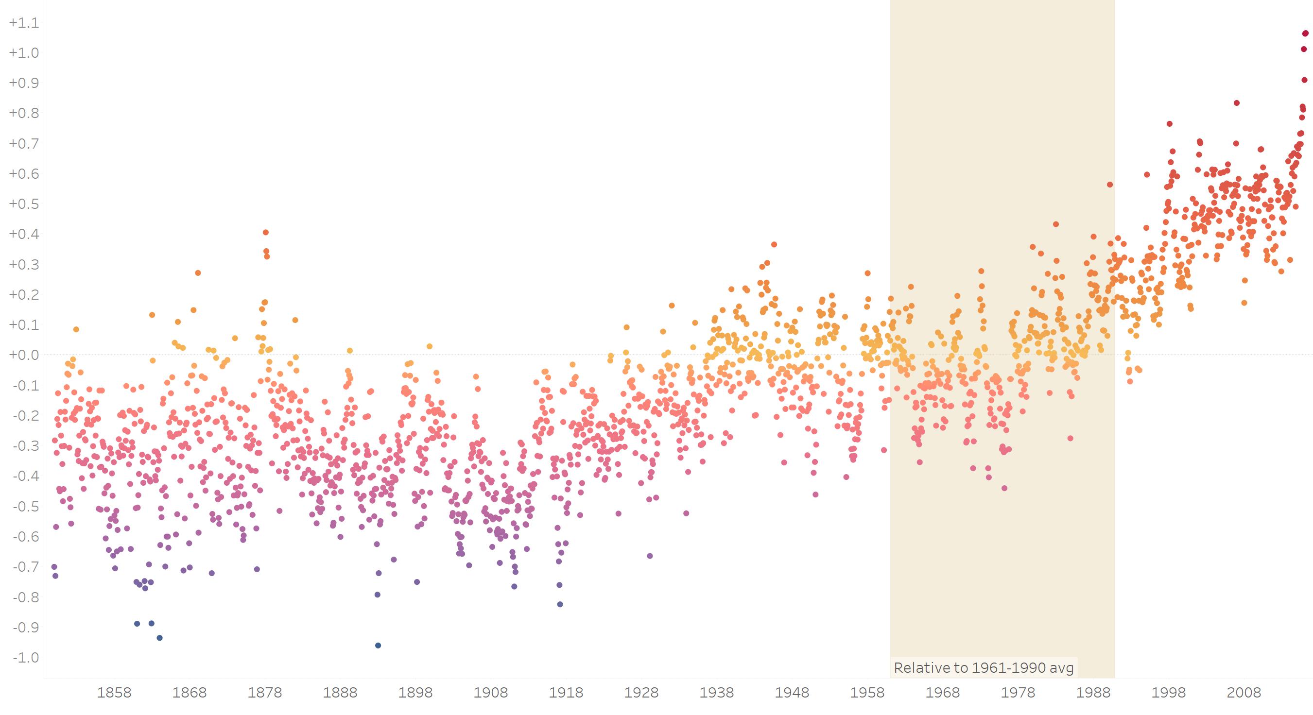
Image source: tableau.com
This chart shows rising global temperatures; it takes average temperatures between 1961 and 2010 as the baseline, and then compares temperatures between 1850 and 2016 to this baseline. Even if you didn’t read the descriptions, you probably noticed the upward trend, and can quickly make sense of this data. The thing is, there are over 100 points of information on this chart.
That’s the power of data visualization. It allows us to make sense of a large amount of information quickly.
Contrary to popular belief, data visualization is not simply the last step of an analysis – there’s more to it than simply creating a quick chart for a presentation to management; it’s part of visual analytics.
Imagine you were tasked with comparative analysis of dietary trends across 150 countries. Looking at all this data in the form of a table would take a long time. Now take a look at the chart below.

Image source: tableaupublic.com
This chart shows dietary trends for 150 countries over 50 years in four categories: calories, protein, fat, and food weight. The world average is taken as our baseline, and each country is then compared to this average. Analyzing this data using visual analytics techniques makes this process much more interesting and less time-consuming.
Let’s filter to category ‘fat’ for example.
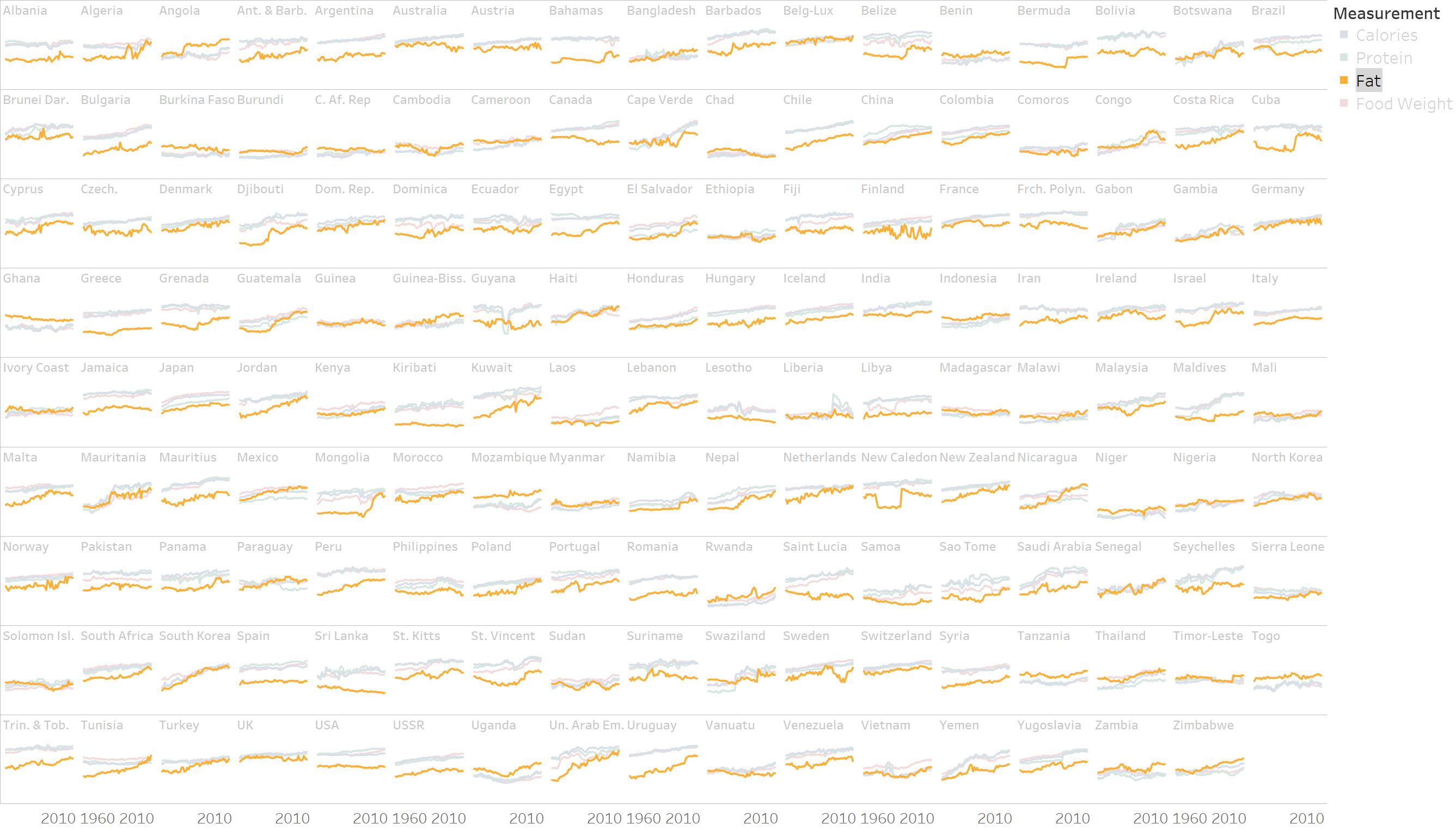
Image source: tableaupublic.com
It is easy to spot which countries have something interesting going on. Look at Canada: the consumption of fat is declining. Now look at Kuwait: here, the consumption of fat is increasing. It’s probably worth diving in and looking at what’s driving these trends.
And that’s the power of visual analytics. It allows us to use data visualization not as the final step of the analysis, when we want to share our findings with the team, but as the means to making sense of large amounts of information, quickly.
A large portion of our brain is dedicated to visual processing.

Image source: olgatsubiks.com
Our brains can actually process 10 billion bits of visual information per second, which means that as soon as we see a chart, our brains start making sense of it.
The large size of our visual cortex also allows us to take care of visual information in what psychologist Daniel Kahneman calls “System 1,” which is “is the brain’s fast, automatic, intuitive approach.
System 2, meanwhile, is “the mind’s slower, analytical mode, where reason dominates.”
“System 1 is…more influential…guiding…[and]…steering System 2 to a very large extent,” Kahneman says.
Being part of System 1, data visualization is more likely to result in actions and decisions than any other type of analysis.
As a data scientist or a data analyst, you need to offer clear insights and trends, and then be able to communicate them effectively.
In fact, the ability to communicate is what often determines the success of analysts and data scientists. Knowledge of math and statistics, experience in coding, and even domain knowledge is not going to be sufficient to move the needle in any organization. Data scientists and analysts need to communicate their findings in a clear, concise, and easy-to-digest manner. And as you’ve probably realized by now, data visualization does this best.
A quick search on LinkedIn for “data visualization” returned 9,000 jobs worldwide. I then used Python to collect job descriptions. Here’s what I found in terms of necessary skills:

Image source: olgatsubiks.com
Data visualization overlaps with other roles in data, including software development, data engineering, and data science. Knowledge of Tableau, a data visualization tool, is in high demand, but the use of other data visualization tools is often required as well, including Microsoft PowerBI, Qlik, MicroStrategy, and Adobe Cloud. The ability to wrangle data using SQL, and understanding of core databases such as SQL Server and Oracle can also be essential.
The rapid growth of data volumes won’t be slowing anytime soon. Data visualization removes barriers to data analysis. Those who can manipulate these tools will turn data visualization to their advantage and move ahead in their careers.
Are you ready to harness the power of data visualization? Check out BrainStation’s Data Analytics course to get core skills and learn about data visualization.
Get the latest on upcoming courses, programs, events, and more — straight to your inbox.

You have been added to our mailing list, and will now receive updates from BrainStation.
London has established itself as a global tech powerhouse. How will the city make the most of this movement to ensure prosperity for businesses and talent?
Learn more about BrainStation's Intro Day, a popular event series that gives aspiring students a chance to try our coding bootcamps for a day while connecting with bootcamp alumni and hiring partners.
Protect your assets with our Cybersecurity course, designed to provide a detailed understanding of the threat landscape, and how to secure mission-critical data.